


Clever idea Vox, but we are after a logo not a poster. Better luck next time.


Clever idea Vox, but we are after a logo not a poster. Better luck next time
Originally Posted by ez64

this was an idea for a spray and i messed up 1 of em using this URL so if u want 1 as an advert spray id say this 1
but if u only want a header then np
The logo that we will end up from this competition will be used in the official ATK sprays as well as other things. You can use your personal sprays but if you want to advertise the Community you should use official sprays.

Screw Uncle Sam, you never heard of Kitchener?
"If at first you don't succeed, spend a lot of money to have a professional do it for you."
My Battlelog

Chazlene has a point. Also, I would personally like to say CEASE ALL USE OF PHOTOSHOP, You can't do it so either give up or learn some style and use a tutorial and are you colour blind, those things are so garish... ewwww YUCK.
I speak for everyone.
Go here to see something I did on Photoshop.
Last edited by VoX; 31st March 2007 at 09:51 AM.
Here is something Peephole did:
@ Peephole, It would be great if you could post some more variations of this. At the moment I would rate that 8.5/10 .
Everyone else, if you have any feedback on this image please post here.

lol vox the pic u made actualy looked nice! ^^

Heres other versions:
and:
Dunno whats wrong with the stroke, but ill have a look at it
Last edited by geK; 31st March 2007 at 01:29 PM.
Excellent work, at the moment I prefer the last one. I have told you on Xfire what I think should be done.
I get dodgy strokes like that as well Peephole, what I do instead is use a drop shadow or outer glow instead, so it's blurred instead of jagged, and it looks nicer than a basic stroke.
Another one I've done:

"If at first you don't succeed, spend a lot of money to have a professional do it for you."
My Battlelog
Very nice indeed Chazlene. I would definitely like our logo to be 3D if at all possible. The logo at the moment seems to be like it could be a lot better, and I am not sure if I like the way the letters are scattered. Feedback from others is always helpful.
Behold the 3Dness:

"If at first you don't succeed, spend a lot of money to have a professional do it for you."
My Battlelog
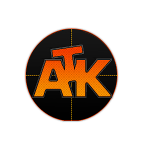
Some more from Peephole:
1.
2.
Chazlene, I really like your recent 3D image. I have talked to you over Xfire about this, but I think it would look great if they were inside a shape, that would really finish it off (the shape would also have to be 3D).
Peephole, I like the images but I feel that they have become a little messy and a lot of the lines on both images are very sharp and jagged. If you could make the crosshair seem more 3D then I think that would help a lot.
Chazlene's do look so much more polished (no offense Peephole). Very nice chaz anyone of them could be it tbh.
There are currently 1 users browsing this thread. (0 members and 1 guests)
 Posting Permissions

 Reply With Quote


Bookmarks