


Well here it is.. my very first go at a sig for the forums. What do you guys think?
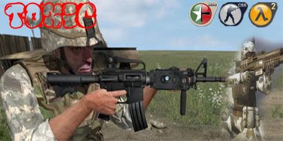


Well here it is.. my very first go at a sig for the forums. What do you guys think?


This is ugly.
the icons have jagged edges and the battle field 2142 pic is badly transformed, hold down shift when u change the size
good blending just the colours dont match
text is unclear too


Umm...errr....too many things to complain about.
No offense.
"If at first you don't succeed, spend a lot of money to have a professional do it for you."
My Battlelog
Yeah well ok i would like some advice maybe?
www.good-tutorials.com
to many colours clash
KISS (keep it simple stupid)
lol its like talking to me a few weeks back
There are currently 1 users browsing this thread. (0 members and 1 guests)
 Posting Permissions


 Reply With Quote

Bookmarks