


Well here it is.. my very first go at a sig for the forums. What do you guys think?
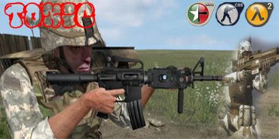


Well here it is.. my very first go at a sig for the forums. What do you guys think?


This is ugly.
the icons have jagged edges and the battle field 2142 pic is badly transformed, hold down shift when u change the size
good blending just the colours dont match
text is unclear too


Umm...errr....too many things to complain about.
No offense.
"If at first you don't succeed, spend a lot of money to have a professional do it for you."
My Battlelog
Yeah well ok i would like some advice maybe?
www.good-tutorials.com
to many colours clash
KISS (keep it simple stupid)
lol its like talking to me a few weeks back
VoX considering you said mine was so shit i seem to remember your first go...
yeh but look below
Yeah but you have done loads to get like that. Certain people are good at different things, most of you are good at sigs where as i'm good at digi-mods. I was just trying a new thing out, no need to be so nasty.
I realy dont think you should be cocky, your first sig you done was alot shiter then his attempt. and tbh to learn how to make a sig like that one you have on dosent take more then five minutes (was at collage for a year doing graphic design) follow Chaz's tutors toxic.Originally Posted by VoX

Thanks for the advice subsurfaceI'll try and follow one of the tutorials.
collage? You were at a giant art exhibition with a giant cut and paste picture? Surely you mean college. sNk: Educated by the best in graphic design but shame about the spelling.
Last edited by Hutch; 8th April 2007 at 10:16 AM.
Ok mate, try out these tuts:
http://planetrenders.net/forums/inde...howtopic=34983
http://img19.imageshack.us/my.php?im...ialfullqw6.png
http://www.pixel2life.com/forums/ind...c=29489&hl=sig
Cmon guys, not bad for a first effort.
i smoked a daughter of bud on my english exam, thats my excuse.
What are we looking at? I see a green splodge, with a array of crappy brushing...
There are currently 1 users browsing this thread. (0 members and 1 guests)
 Posting Permissions


 Reply With Quote

Bookmarks