


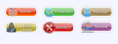
I did some:


I did some:


Undeaded, I really like yours. Here are a few ways to improve them:
--> make them wider and not quite as deep. More like the images in this:
--> I like the icons for the newbie, banned, clan leader and member although I think that the admin and moderator ones could be slightly better. For the moderator I would prefer to see a pen and paper. The admin icon would look better with just the tools I think, I can't really make out what is meant to be beneath them.
--> It would be nice to see some more, we are missing "Contributor" and "Founder".
--> Would the border look better if it was a little darker like the images above?
As I said, they are mostly very good. Well done.
Originally Posted by ez64

Can you please teach me/give me some pointers on how to do them? And also give me the grtadient thing you use for them please.
Last edited by VoX; 22nd April 2007 at 06:59 PM.
@ Vox : No and er...maybe lemme find them:
http://www.dezinerfolio.com/2007/03/...free-download/
Chalex, I'll do it now... lemme have a look see.
YAY! Thanks Undeaded, I'll talk to you if I have trouble installing.
Done :
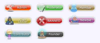
Wow, I must say Undeaded that they are amazing. In my opinion these are certainly good enough to be used on the website.
Sorry, but since my last post I realised that there is no image title for "Graphic Designer" - it would be great if you could design one with the image being a paint palette. I think that you should be awarded this title because of your hard work in SOTW and in these new titles.
Sorry to be picky, but I still think the borders in the others are a bit more defined, with a sharper edge. If you added borders like that to yours, they would be perfect.
So, as soon as you have made that last title and made some changes to the borders, I will be willing to upload them to the site as soon as you are done. Since we have had no reply from Chazlene about him designing them, I think we can use yours.
Will do tomorrow. Can't be bothered now, and I need to do some stuff.
No problem, we will finish this off tomorrow.

Where'd you get those icons in the bars Undeaded?
I'm not going to attempt to make any which all have the same style, because I think it looks too dull that way.
"If at first you don't succeed, spend a lot of money to have a professional do it for you."
My Battlelog
search icons on google and click on Leo's archive.

Could we have some ranks above member that are different and anyone can get for post count, I mean like loads more.
Yeh, could we have like CSS Admin and TS Admin and stuff like that cause at the mo there are people that have been in C2G ages with the same rank as like BaD-BoY
I was meaning like for post count, 200= C2G Troll
300= SPAARTAN!
400= C2G Longcat
etc etc etc.
Yeh i see where your coming from, so things like 1000 (full bar)=FORUM ADDICT!
There are currently 1 users browsing this thread. (0 members and 1 guests)
 Posting Permissions

 Reply With Quote


Bookmarks