Page 1 of 2 12 LastLast
Results 1 to 15 of 18

Thread: Windows 8 Consumer Preview

  1. #1
    Administrator Chalex4's Avatar
    Join Date
    Feb 2007
    Location
    Oxfordshire, UK
    Posts
    2,706
    Gamer IDs

    XFIRE ID: chalex4 Steam ID: chalex4

    Windows 8 Consumer Preview


    Windows 8 Consumer Preview (Beta) is here!

    Download Setup (recommended)
    Download x64 ISO (3.3 GB)
    Download x32 ISO (2.5 GB)
    Product Key: DNJXJ-7XBW8-2378T-X22TX-BKG7J

    I've just downloaded it now and have partitioned off 30GB of my main drive to install it onto. I used the Developer Preview and thought is was pretty cool, but didn't think the keyboard/mouse implementation was that great. Have heard that the Consumer Preview basically fixes all those problems though, which is awesome .

    You guys going to download?


    PS. Metro is awesome! I need a tablet.
    Quote Originally Posted by ez64
    chalex has so much control we control ourselves

  2. #2
    ATK Leadership Colonel Mitch's Avatar
    Join Date
    Feb 2007
    Location
    North west - Barrow-in-furness
    Posts
    2,310
    Gamer IDs

    Steam ID: Pierd1989

    Re: Windows 8 Consumer Preview

    Quote Originally Posted by Chalex4 View Post

    PS. Metro is awesome! I need a tablet.
    ANYONE with windows 8 needs a tablet

  3. #3
    ATK Member Isphera's Avatar
    Join Date
    Feb 2007
    Posts
    3,962

    Re: Windows 8 Consumer Preview

    I won't DL it because I don't tend to screw around with that stuff anyway until release, but I doubt I'll get it at all. I really don't like that style layout and it would more than likely piss me off quite quickly. If there isn't an option to switch it to a standard view, then I have no problem staying with 7.

  4. #4
    ATK Member
    Join Date
    Aug 2010
    Location
    Liverpool
    Posts
    196
    Gamer IDs

    Steam ID: kiliv

    Re: Windows 8 Consumer Preview

    Im going to give it a go on my tablet later will let you guys know how it goes
    marshy fails, that is all.

  5. #5
    Yellow and mellow Calneon's Avatar
    Join Date
    Oct 2007
    Location
    Portsmouth
    Posts
    3,488
    Gamer IDs

    Steam ID: 76561197977918917

    Re: Windows 8 Consumer Preview

    Metro is fucking dreadful unless you're on a tablet, there's really nothing else to it. No amount of 'fixing' is going to make it work well with a mouse and keyboard. Why the fuck would I want to be able to swipe between programs with my mouse when I could use the taskbar and alt-tab? Also I'm not a retard who needs buttons that take up half the screen.

    Yes, it is nice for tablets, and there are improvements to the OS outside of the Metro interface, but please keep that crap off my desktop PC.

    i7 920@3.8 | GTX280 | HAF 932 | 6GB | Corsair 520W
    Hazro 24" | Logitech Illuminated | G500 | Creative 2.0 | Nikon D3100


  6. #6

    Re: Windows 8 Consumer Preview

    Quote Originally Posted by Calneon View Post
    Why the fuck would I want to be able to swipe between programs with my mouse when I could use the taskbar and alt-tab? Also I'm not a retard who needs buttons that take up half the sceen.
    This pretty much summs up my opinon on this, it seems crazy they would even this about encorparating this onto a desktop PC, anyone that gets this for a desktop is simply doing it for the gimick approach there really is no point to this outside of a tablet.

    And oric never consider getting this at release if you have windows 7

  7. #7
    Community Manager Chazlene's Avatar
    Join Date
    Feb 2007
    Location
    Southampton, England
    Posts
    2,313
    Gamer IDs

    Steam ID: chazlene

    Re: Windows 8 Consumer Preview

    Of course they had that sort of music in the video.
    "If at first you don't succeed, spend a lot of money to have a professional do it for you."


    My Battlelog

  8. #8
    Administrator Chalex4's Avatar
    Join Date
    Feb 2007
    Location
    Oxfordshire, UK
    Posts
    2,706
    Gamer IDs

    XFIRE ID: chalex4 Steam ID: chalex4

    Re: Windows 8 Consumer Preview

    Sure, they're changing the paradigm, but it works. Half the reason they're releasing it this early must be so people can get used to it. Think about this, what do you do on your desktop PC? For most people, a lot of that stuff is on the web. I check Facebook, my Gmail/Hotmail, the news, the weather, stock price and of course all of my favourite other sites etc. Why should I have to manually search for this stuff every time? I'd much rather see all that stuff on my start screen, right there.

    For your favourite sites, you can pin them. So, right there on your start screen will be an ATK icon . For things like news, there'll be apps, so without even going to a website, I'll be able to see what the latest news is on a live tile. If I want more, I click it. Of course though, the Metro-style interface isn't ideal for all desktop use, which is why the normal desktop is there. It's just as it was before, but better with a LOT more functionality, polish and performance tweaks. So I can play my Steam games, write my uni dissertation on Word and create a website on Dreamweaver just like usual.

    One thing I really like is being able to effectively have a mini version of an app open on my screen. So whilst using Word on the desktop, I can have my mini email app open on the right. Anything comes in, I can easily deal with it. Apps are designed to work great in this mini view, compared to normal mail applications/the web which only really looks great when you at least have 800px width of it.

    All that said, there are obviously other things they can do to improve, but it is only a preview after all. There's a pretty good demo of it all here (skip to 3:38 for the keyboard/mouse bit):

    Quote Originally Posted by ez64
    chalex has so much control we control ourselves

  9. #9
    Yellow and mellow Calneon's Avatar
    Join Date
    Oct 2007
    Location
    Portsmouth
    Posts
    3,488
    Gamer IDs

    Steam ID: 76561197977918917

    Re: Windows 8 Consumer Preview

    Ok Chalex. Let's say I'm on my desktop on Windows 8 and I want to go to ATK. Normally, I'd have to click on the Chrome icon on my taskbar and then click on my ATK bookmark in Chrome. OH GOD SO HARD. Now in Windows 8 all I have to do is click on the start button to bring up the Metro interface, and then click on the ATK icon! OH GOD SO MUCH EASIER!

    I have like 100+ bookmarks, how is that meant to work on the Metro interface? Do I have to scroll through over 100 icons to find the site I want to go on? Does that list also include all my programs? You said it also contains the latest news, stocks, and weather. Seems like it's going to be a clusterfuck of text and icons am I right? From what I've seen you can't group up icons so am I going to have to scroll through 5 pages of icons to find what I want?

    Also, seems to me that websites only have a graphic for the favicon, are websites going to have to make a new large icon for display in the Metro interface? Either that, or all of these icons are going to look butt ugly with either no image or the small favicon.

    I'm sorry Chalex, I know you work for Microsoft and really want to make us think that Windows 8 is the next best thing, but you really have to stop talking like a member of the Microsoft sales department, it's getting quite ridiculous. Metro is going to be awful for desktop use and I think you're the only person here that disagrees with that.

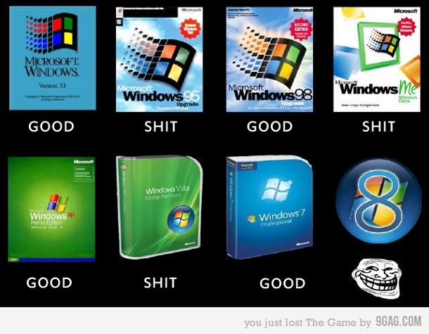
    EDIT: Just saw a comment on the YouTube video Chalex posted, seems rather relevant...

    "Win98 - good
    WinME - bad
    WinXP - good
    Win Vista - bad
    Win 7 - good
    Win 8 - *trollface*"
    Last edited by Calneon; 2nd March 2012 at 01:07 AM.

    i7 920@3.8 | GTX280 | HAF 932 | 6GB | Corsair 520W
    Hazro 24" | Logitech Illuminated | G500 | Creative 2.0 | Nikon D3100


  10. #10
    ATK Leadership Colonel Mitch's Avatar
    Join Date
    Feb 2007
    Location
    North west - Barrow-in-furness
    Posts
    2,310
    Gamer IDs

    Steam ID: Pierd1989

    Re: Windows 8 Consumer Preview

    On my pc I agree a lot of what I do is online, but you know what?

    I turn on my pc.... Opera auto starts, and automatically loads all of my tabs. DONE. No clicking on anything.

    And as for the apps i use regularly, they're pinned to the taskbar / on autostart.

    The main feature i've always hated on smartphones was what windows 8 is bringing in, the area full of icons for everything, pages and pages of icons rather than the standard folder structure.

    I can see windows 8 being great on a high power tablet, don't get me wrong there, but all of the things like "charms" with the mouse just mean you have to go and hover somewhere rather than just clicking a button.... That kind of stuff looks horrific.
    Last edited by Colonel Mitch; 2nd March 2012 at 05:29 AM.

  11. #11
    ATK Member Isphera's Avatar
    Join Date
    Feb 2007
    Posts
    3,962

    Re: Windows 8 Consumer Preview

    Quote Originally Posted by Calneon View Post
    "Win98 - good
    WinME - bad
    WinXP - good
    Win Vista - bad
    Win 7 - good
    Win 8 - *trollface*"


    Agree with the above though.

  12. #12
    ATK Member Vicious Horizon's Avatar
    Join Date
    Jan 2008
    Location
    Oxfordshire, Banbury
    Posts
    2,984

    Re: Windows 8 Consumer Preview

    Quote Originally Posted by Isphera View Post
    <Image>
    Agree with the above though.
    What about NT and 2000?

    *trollface*
    Take that ya one-eyed, bomb-lobbin', cactus eatin', pot bellied, thug fat jigglin-chicken whoopin' big, back-stabbin lob-armed creepy spastic bloody, blind-eyed pashy little twitchy pickle-headed rocke- hoppin, potato-poppin' phony two-faced stealthy mutant bastard!


  13. #13
    Administrator Chalex4's Avatar
    Join Date
    Feb 2007
    Location
    Oxfordshire, UK
    Posts
    2,706
    Gamer IDs

    XFIRE ID: chalex4 Steam ID: chalex4

    Re: Windows 8 Consumer Preview

    Quote Originally Posted by Calneon View Post
    I have like 100+ bookmarks, how is that meant to work on the Metro interface? Do I have to scroll through over 100 icons to find the site I want to go on? Does that list also include all my programs? You said it also contains the latest news, stocks, and weather. Seems like it's going to be a clusterfuck of text and icons am I right? From what I've seen you can't group up icons so am I going to have to scroll through 5 pages of icons to find what I want?
    I think I'd pin something like my 10 favourite sites to the start screen. I'd use the normal version of IE/Chrome/Firefox/Opera for my other hundreds of favourites. You can pin anything to the screen, so you can have apps or normal desktop applications there too. By default, it doesn't include everything, you have to choose what you want to have there. When you install something though, it will appear (I think).

    You can also group and name your groups on the start screen, which should help to reduce the 'cluserfuck of text and icons'. In terms of the favicon thing, I do actually agree. I don't want the small favicon there, I want to be able to add some extra lines of code to the site to get something nicer to appear. Problem with that though is that not all sites would do it, so I don't know if there's an easy solution. Perhaps that'll change with the full release, I don't know.

    But yeah, for current Windows power users (like us), I think the Metro start screen is less handy. Like Mitch said, we have all our applications open on boot, and have all our tabs when we open our browser. A metro 'glance' view may not be as useful, unless we fundamentally are happy to change the way we interact with our PC. As with all change, some people like it, some people don't.
    Quote Originally Posted by ez64
    chalex has so much control we control ourselves

  14. #14
    Yellow and mellow Calneon's Avatar
    Join Date
    Oct 2007
    Location
    Portsmouth
    Posts
    3,488
    Gamer IDs

    Steam ID: 76561197977918917

    Re: Windows 8 Consumer Preview

    Don't the links on Metro open in the Metro version of IE (the one where it takes up the whole screen and there's no taskbar or anything), unless there's a way to change that, why would you want two browsers open at the same time?

    i7 920@3.8 | GTX280 | HAF 932 | 6GB | Corsair 520W
    Hazro 24" | Logitech Illuminated | G500 | Creative 2.0 | Nikon D3100


  15. #15
    Administrator Chalex4's Avatar
    Join Date
    Feb 2007
    Location
    Oxfordshire, UK
    Posts
    2,706
    Gamer IDs

    XFIRE ID: chalex4 Steam ID: chalex4

    Re: Windows 8 Consumer Preview

    Yeah, I think you're right, it does open in metro IE. Forgot about that. What's quite interesting is that tablet users should never have to see the desktop, but for keyboard/mouse users, we need to use both. It would be cool if there was a way to make things open in the desktop version rather than the metro one.
    Quote Originally Posted by ez64
    chalex has so much control we control ourselves

Thread Information

Users Browsing this Thread

There are currently 1 users browsing this thread. (0 members and 1 guests)

Similar Threads

  1. Windows 8
    By Calneon in forum Off Topic
    Replies: 10
    Last Post: 26th October 2011, 10:10 AM
  2. Replies: 79
    Last Post: 7th March 2010, 09:23 PM
  3. PCGamer has a big preview of WAR.
    By Bloo in forum Role-Playing (RPG/MMORPG)
    Replies: 14
    Last Post: 26th January 2008, 02:42 PM
  4. Pablo Francisco on the movie preview guy
    By Isphera in forum Off Topic
    Replies: 0
    Last Post: 20th January 2008, 10:51 PM
  5. ATK comics Issue #5 Preview
    By Chazlene in forum Media
    Replies: 6
    Last Post: 3rd July 2007, 11:23 PM

Tags for this Thread

Bookmarks

Posting Permissions

  • You may not post new threads
  • You may not post replies
  • You may not post attachments
  • You may not edit your posts
  •  

Affiliates: LochTechMonster, Temple Millar, SamBigos, Addenda Provided, Prime Gaming, Petrol Smell, Game Sprays, Afterlife Gaming, L4D MapDB, Brawl Forum

All times are GMT +1. The time now is 06:59 PM. Powered by vBulletin® Version 4.2.2
Copyright © 2024 vBulletin Solutions, Inc. All rights reserved. Copyright Aim to Kill (ATK) 2014